Design "Find a reseller" for Commercial Site
Design a responsive web page to display reseller info.
Intro
ASUS is planning to launch its commercial site to sell the B2B products, which hasn't be released yet. I've designed a "Find a reseller" page on ASUS commercial site for users to better reach out to resellers in this project.
Methods: Competitive analysis, Wireframe design
My role: Lead UX designer and researcher
Team: 2 UX designers, 1 UX manager
Duration: 2 months, 2021
Problem: Lack of reseller info in current site
In the B2B market, "Partner" is an important relationship between companies that could for instance sell products for ASUS. As a result, for business customers, it's essential to provide them reseller list and contact methods, so that they could contact the reseller directly to purchase products. The page is usually called "Find a reseller", which is commonly seen in many commercial sites, displaying all the resellers' information. However, we didn't provide it in our current site.
How might we assist users to find reseller information easily?
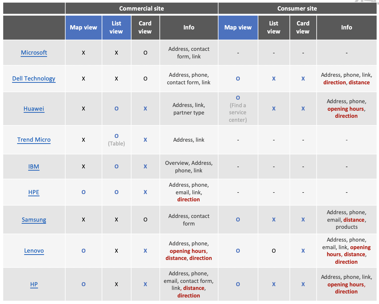
I conducted a competitor analysis of those that provide the "Find a reseller" function in their commercial sites, including Microsoft, Dell, Huawei, Trend Micro, IBM, HPE, Samsung, Lenovo, and HP, comparing the entrance, search function and the content provided on the page for each reseller.
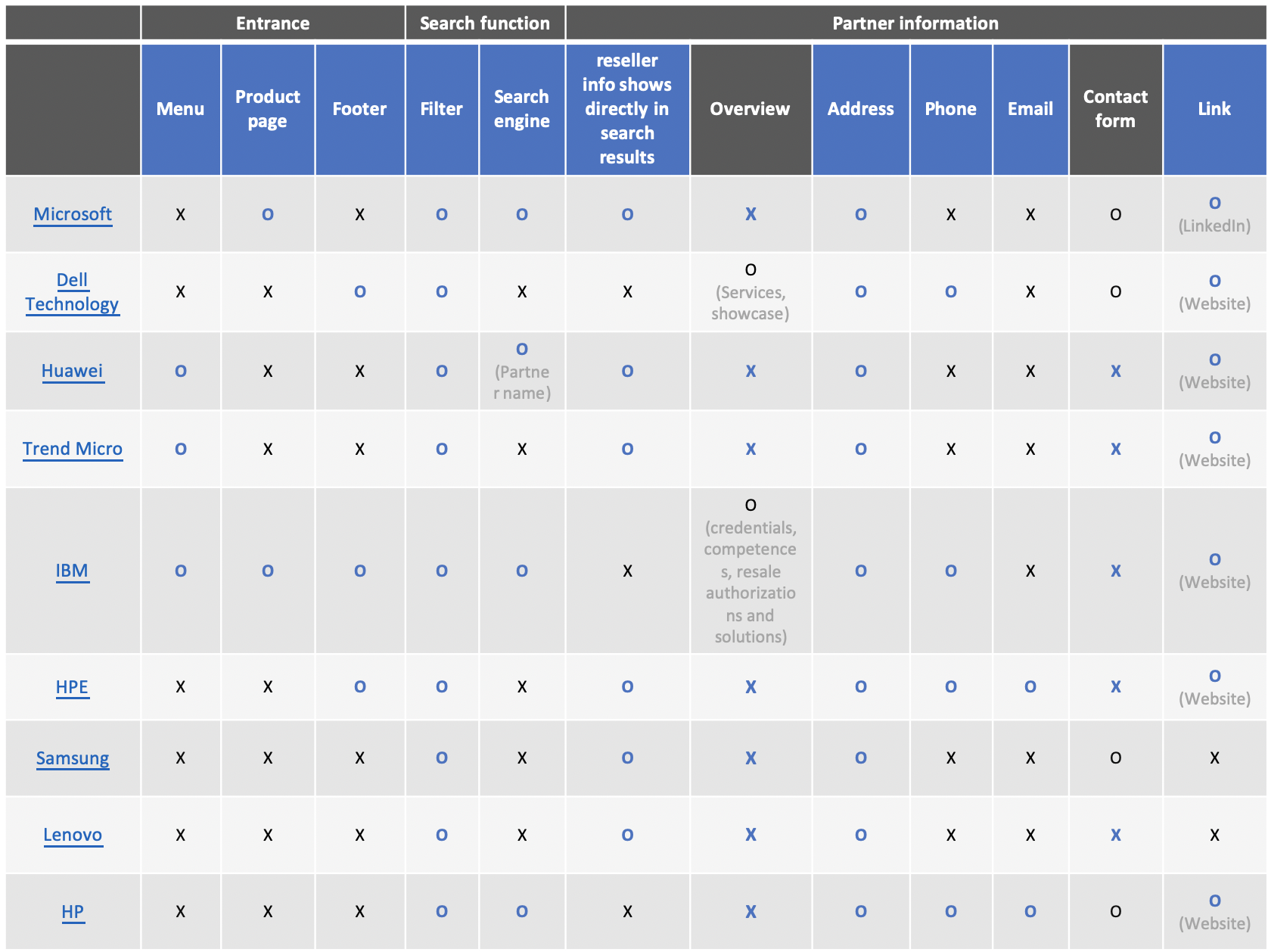
Insight 01: Provide detailed information of each reseller
Reseller detailed information pages are usually presented directly on the same page as the landing page. Address, contact info (phone, email, or form), and link are the most common information types presented.
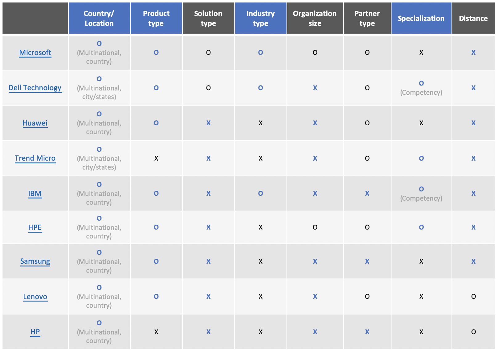
Insight 02: Filter is necessarily provided to filter out best matches for users
- The most common filter conditions are country/location and product type. Only Microsoft provides filters by organization size.
- Partner type is usually provided. However, they're no different partner types for ASUS.
- Only Microsoft provides filters by organization size.
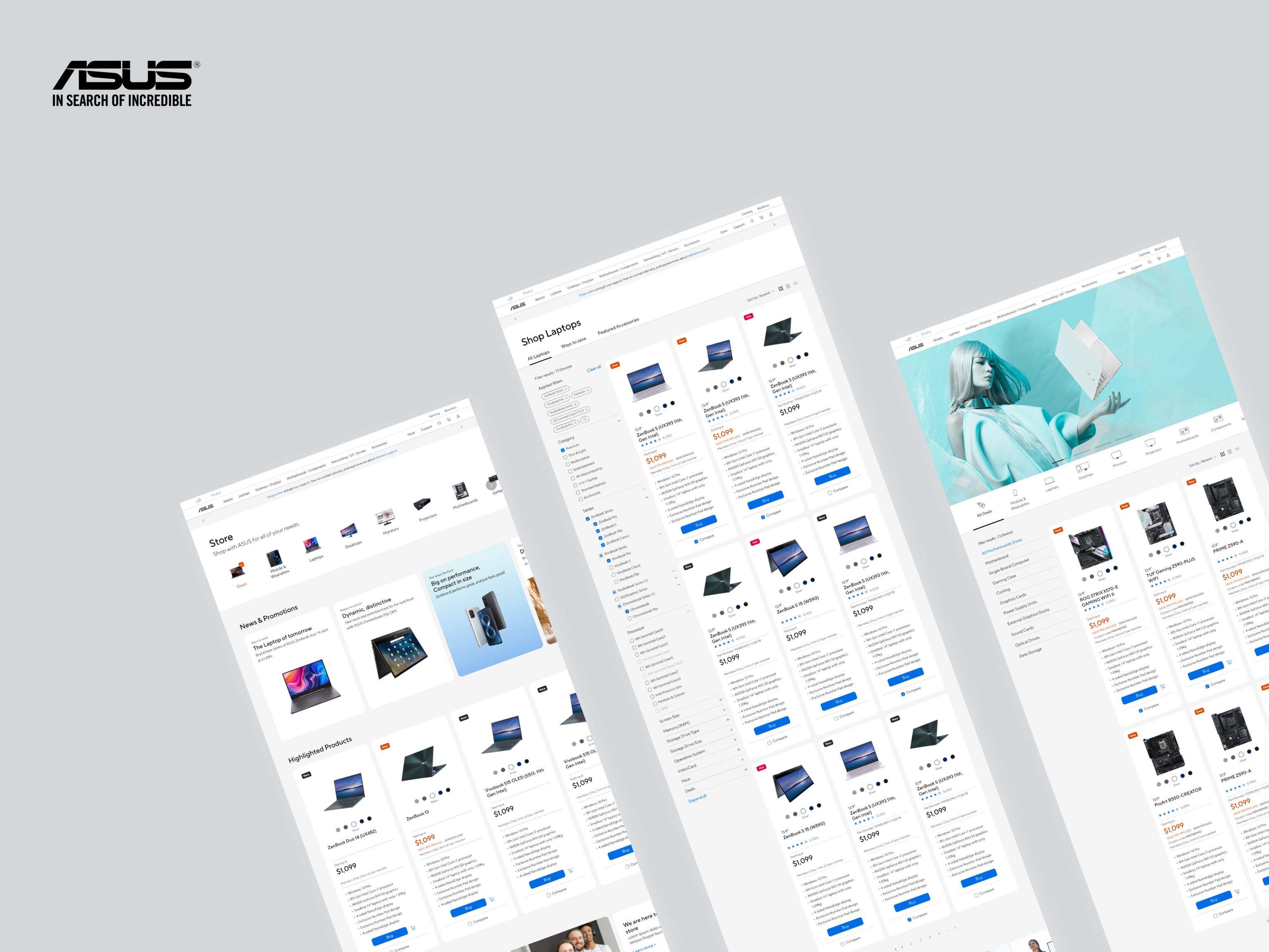
Iterate the view type design of reseller cards
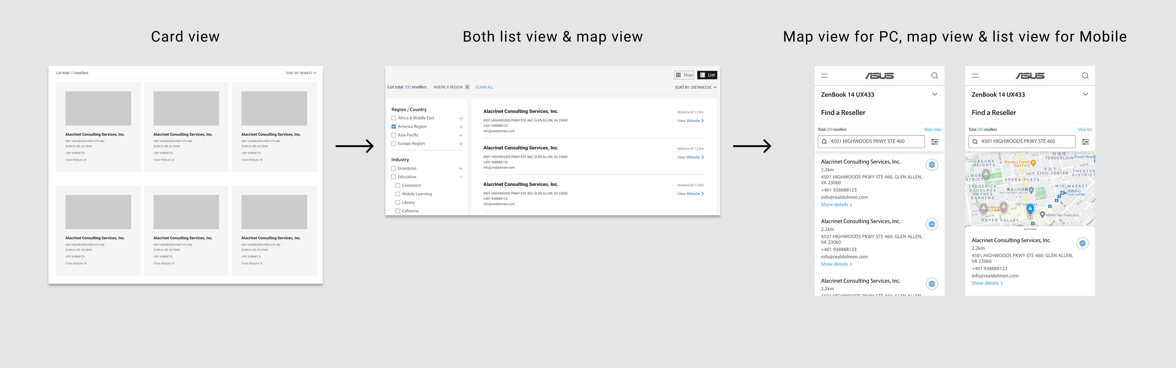
01 Card view
In the beginning, I chose to display reseller cards in card view. However, after the advice from my team manager, I realized that the number of resellers is huge, which wasn't appropriate using card view to occupy too much space.
02 Both map view & list view to switch
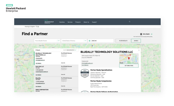
I adjusted to provide both map view & list view so that users could switch, choosing list view as default. My manager questioned me of if it's really necessary to provide two types at the same time; thus, I researched again to compare the view type and metadata of reseller with "Find a store" page in consumer site, which is a similar function for customers to find physical stores to shop.
After the research, we got two findings listing below, which motivated us to put more stress on map view and contact info.
- Most competitors provide map view only, especially in consumer sites.
- For Business customers, they contact the resellers online rather than visiting the physical stores directly. Therefore, Consumer sites usually provide information on distance, opening hours, and direction function, which are less necessary in Commercial sites. On the other side, the contact form is more important for Commercial sites to contact resellers more efficiently.
03 Map view for PC, map view & list view for Mobile
However, I didn't consider the viewpoint differences between PC and Mobile devices. As a result, our final design is to provide only map view for PC, but provide both map view and list view for Mobile, so that user could scroll down easily to see all reseller cards.
Refine the design with stakeholders
We arranged a meeting with the Business site Product manager and the Business product marketing manager to discuss our design. During the meeting, we could understand not only real user needs but also the content that ASUS could provide on-page, which would definitely affect our design. For instance, what kind of filter types could we apply for resellers? Could we use "Specialization types" to categorize our resellers?
Final design proposing to stakeholders
- Provide the page entrance on the footer, form the top menu, and product page.

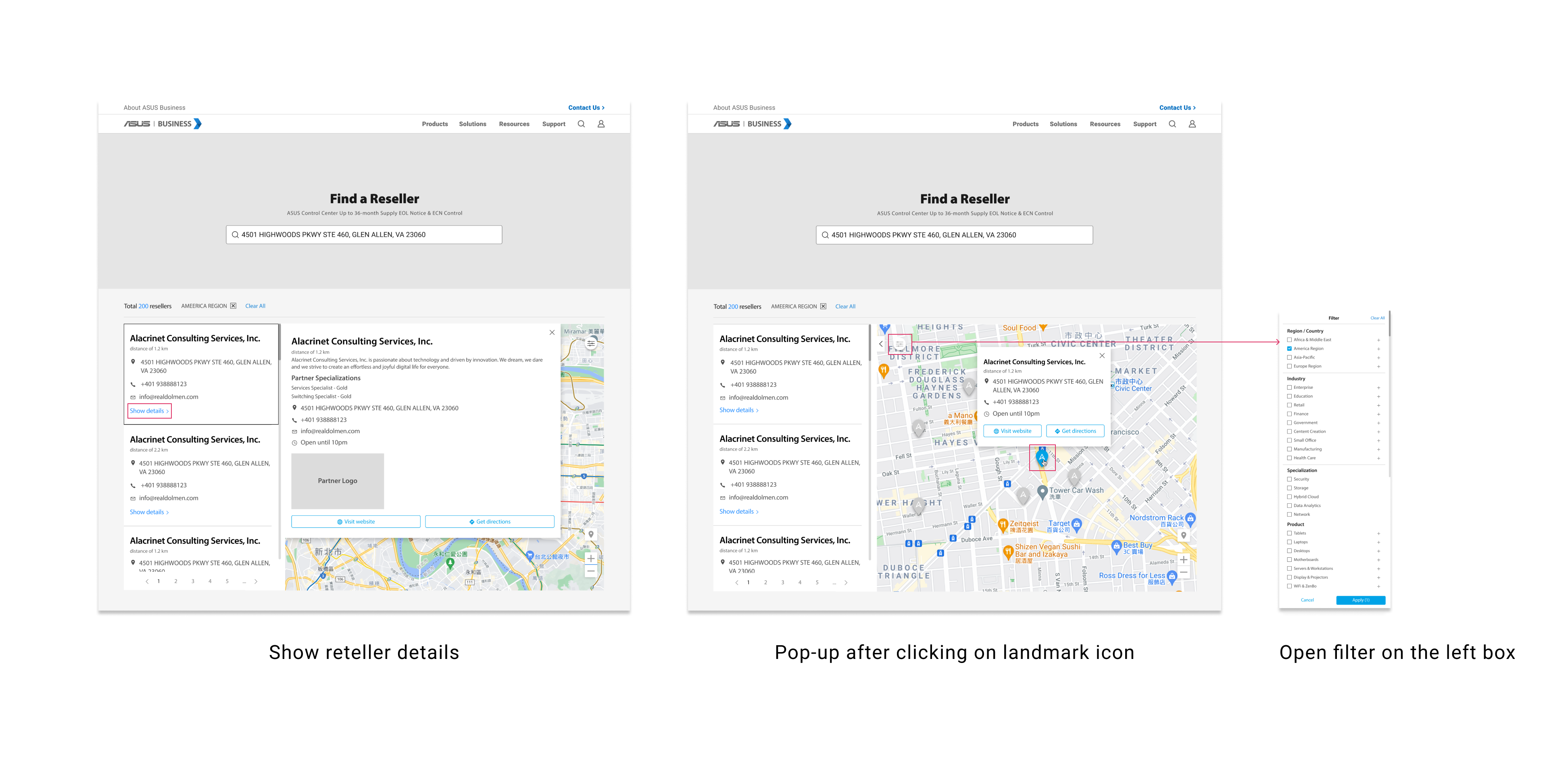
- Provide diverse filters and search engines to screen out the most suitable resellers, e.g. by country/location, product type, industry, and specialization. “Product type” filter conditions are down to model-based. If using local sites, the “Country/Region” filter condition is set as the local country as default.
- Allows users to contact one partner at once, providing detailed information of a reseller, e.g. name, address, phone number, email, and website link. If turning on the location service, the distance between user and reseller is also provided.
Prototyping
PC screen size
Mobile screen size
Key Learnings
➡️ Step into B2B background knowledge
There're still a long path to go before release since Product manager still needs to communicate with other partners, resellers to evaluate the feasibility. However, this project did bring new vision for me into B2B context that I wasn't familiar with in advance. Expect for "Find a reseller" page, I've also designed "About ASUS partner" page, showing the benefits and process to become an ASUS partner.
➡️ Practice responsive design for different devices
I was in charge of web-based design mainly in PC screen sizes. It's a precious opportunity for me to consider more to deliver a user-friendly browsing experience for Mobile users due to the screen size limits.